

BUILDING STRONGER CREATIVE TEAMS
& BRAVER SPACES FOR THOUGHTFUL WORK
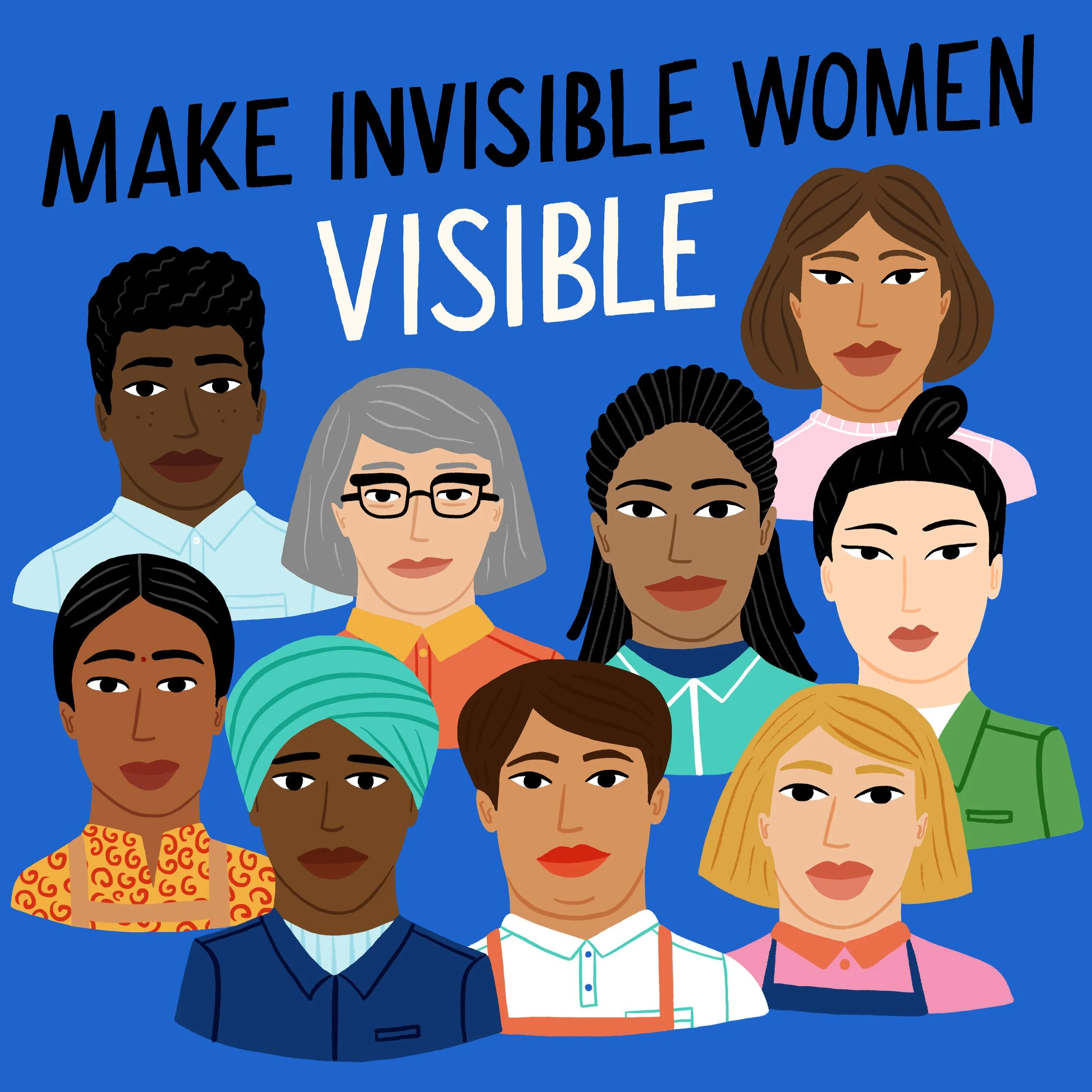
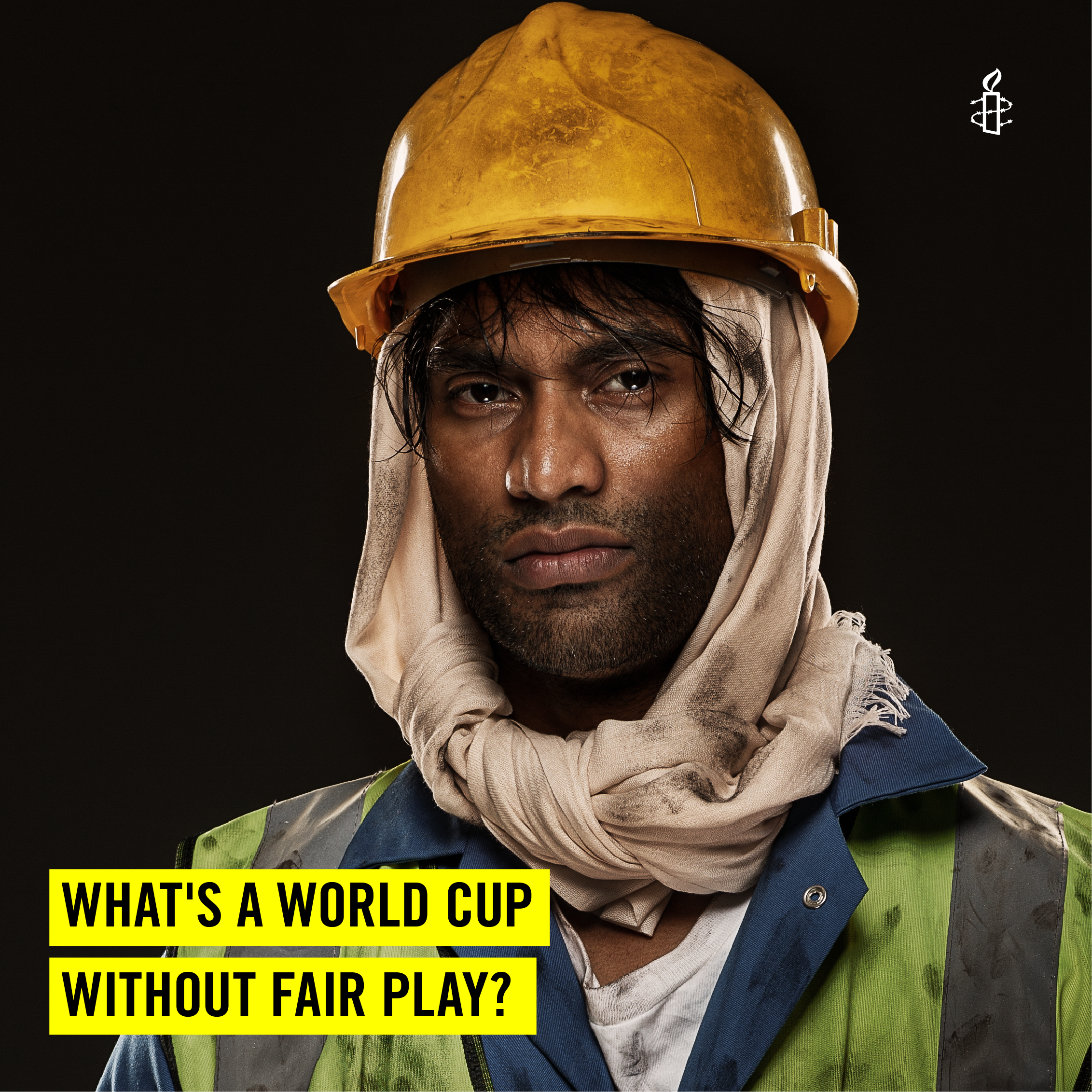
I AM A CREATOR OF EXPERIENCES, IDEAS & CONNECTIONS
My work revolves around people, crafting campaigns, leading studios and building spaces that connect across industries and communities.
![P1999435[3].jpg](https://images.squarespace-cdn.com/content/v1/6256e10a9a84c2306978a6f6/fdb1a661-4464-4319-b397-6e83eb2c0cd0/P1999435%5B3%5D.jpg)


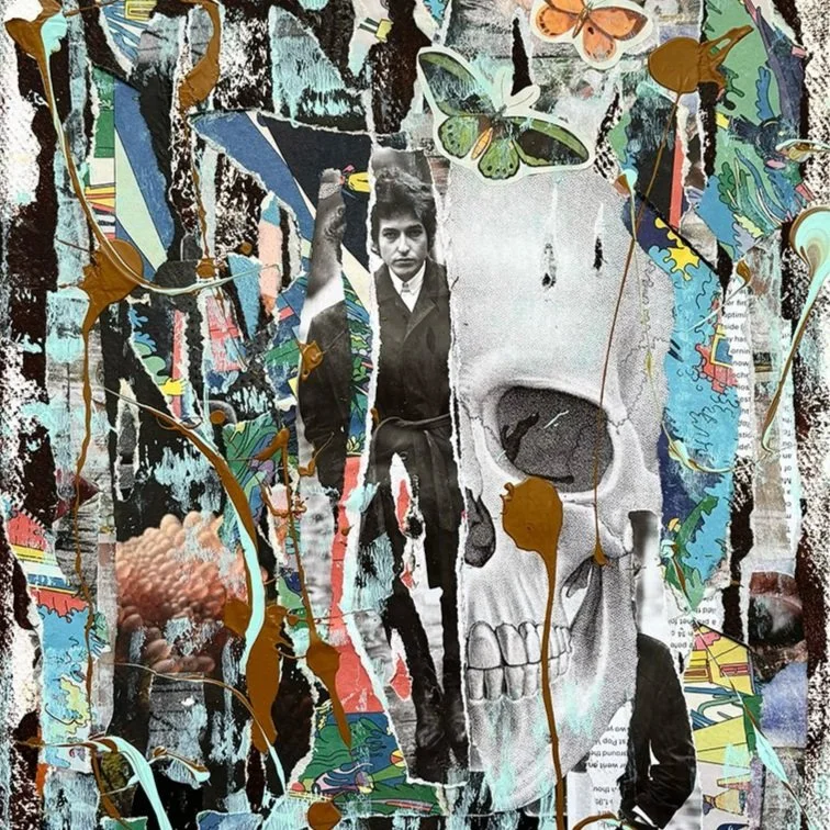


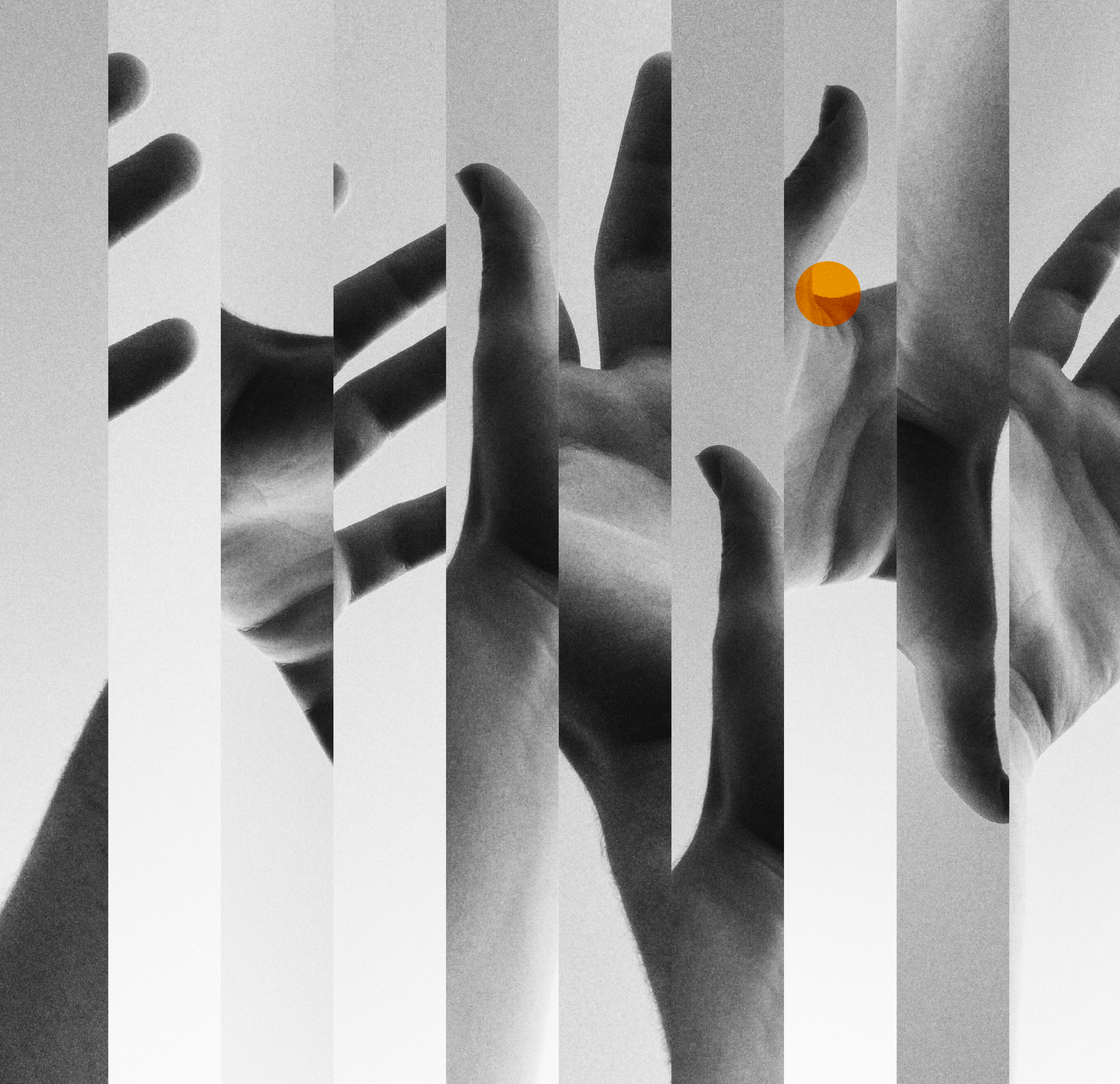
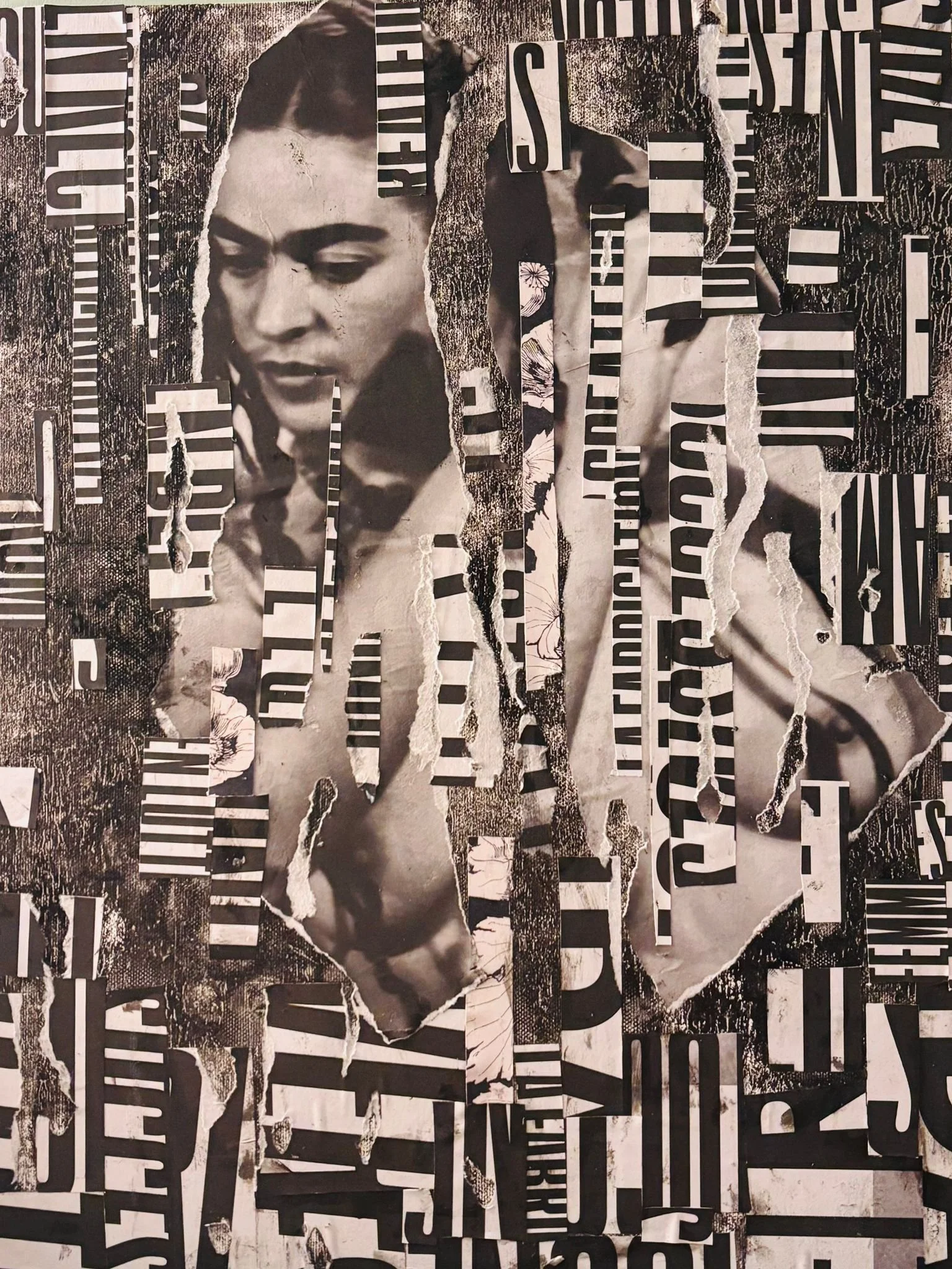
I’m drawn to stories
where visuals
& humans meet
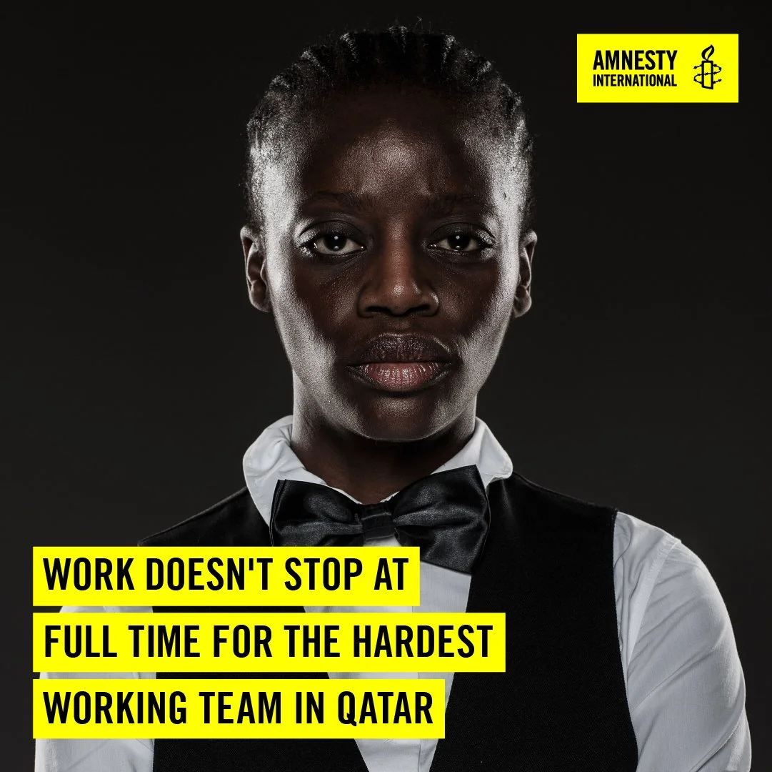
It’s always been about people: how we create together, how we feel like we belong, and how we keep moving forward without burning out or losing ourselves. It’s a daily practice to make space for great work, for real connection and for the stuff that makes us feel alive. The way I choose to connect with people shapes how impactful a job, a project or a collaboration can be.
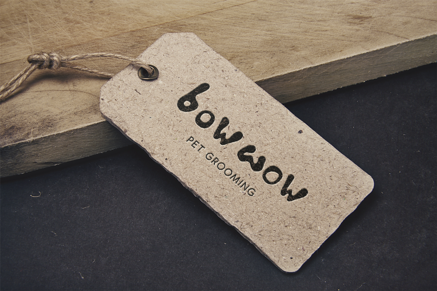
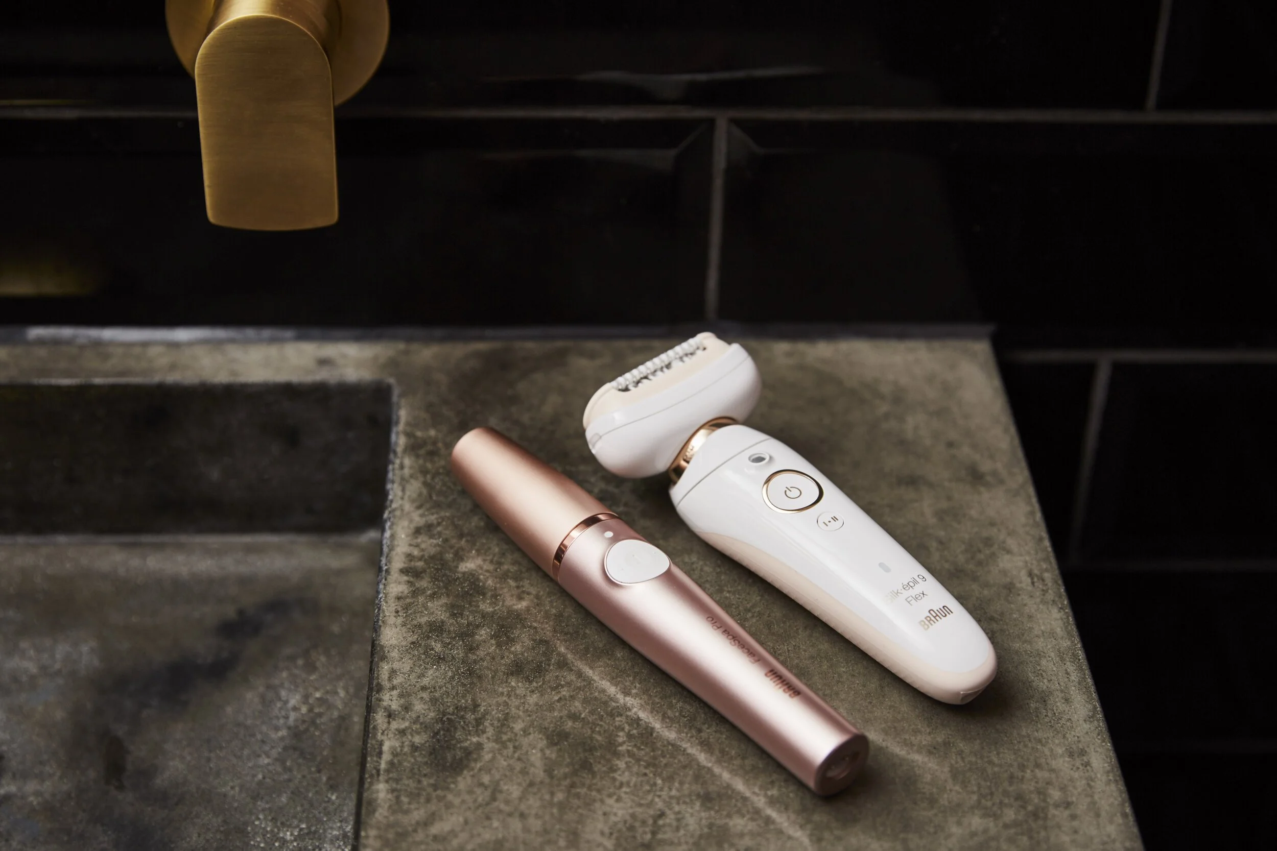
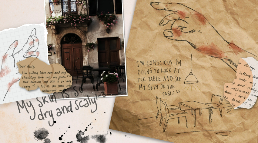
ART DIRECTION
•
COLLAGE MAKER
•
BRANDING
•
COACH & FACILITATOR
•
CONCEPTING
•
DESIGN DIRECTION
•
CREATIVE WORKSHOP
•
CAMPAIGN
•
ART DIRECTION • COLLAGE MAKER • BRANDING • COACH & FACILITATOR • CONCEPTING • DESIGN DIRECTION • CREATIVE WORKSHOP • CAMPAIGN •